COVID-19 has flooded reporters with daily data and I’ve been swimming in it for a year.
Nearly every single day, I’ve watched my inbox for an email from either Joan Carr, public information officer for the Shelby County Health Department, or, more recently, Chip Washington, the public information officer of the department’s COVID-19 Response Team. They became daily pen pals, and I looked forward to hearing from them, though they had no idea I did. I am just one of dozens of reporters and officials on a daily email blast.
These emails come at around 10:30 a.m. They come with such a regularity that once I wrote to Daily Memphian reporter Omer Yusuf when one hadn’t come by noon, worried I’d been booted from the list. (I hadn’t.) There have been slight changes in the ways this data has been delivered since March 2020. But I know the rhythm well enough to know that the updated data on demographics and geography (what I call the “data dump”) comes on Thursday and the new weekly average test positivity rate comes on Friday.
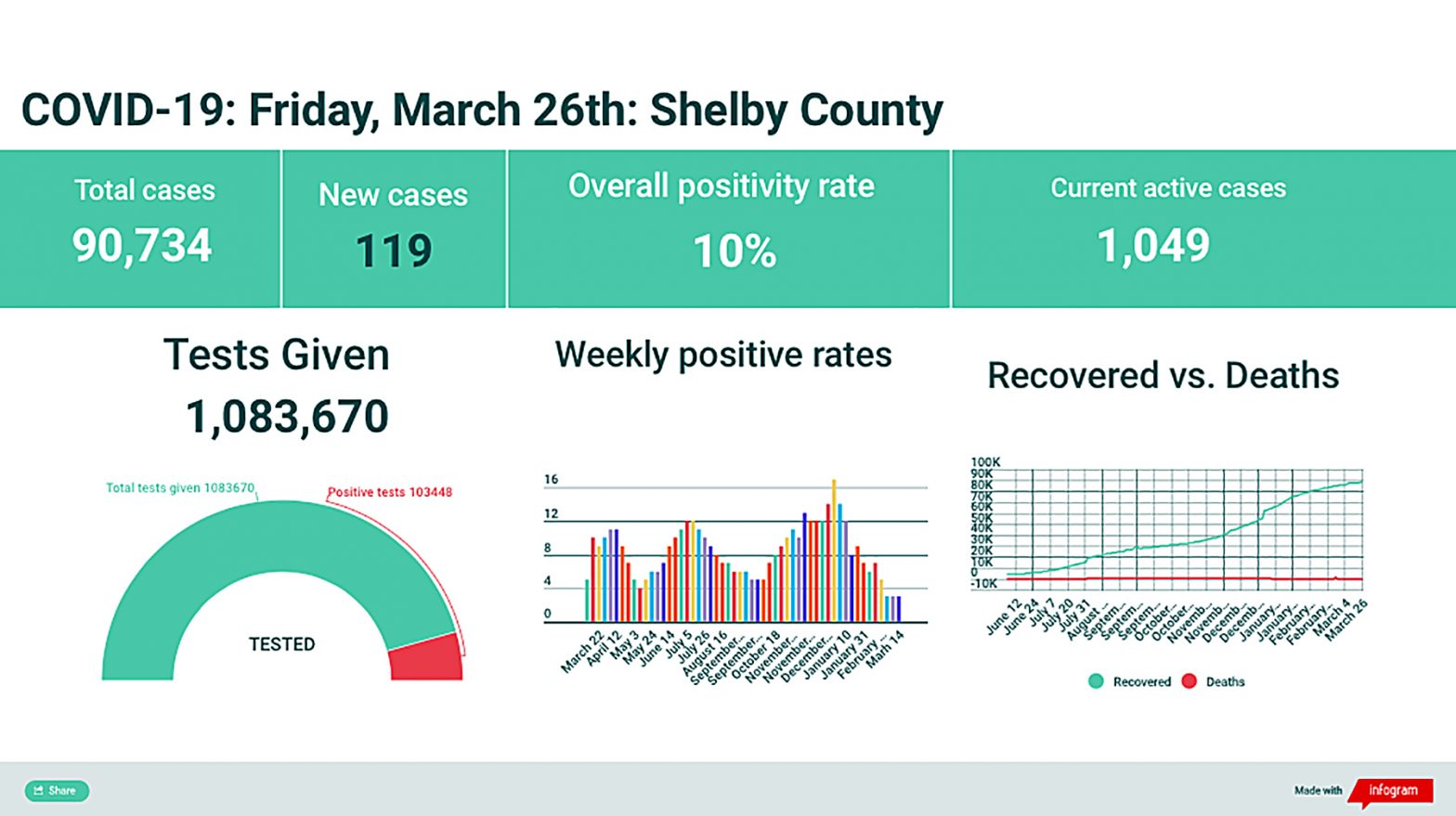
Early on, I just published the health department’s stark black-and-white data graphic, a grim report card. It was the rawest presentation of information describing a virus that seemed to have no mercy. But those numbers didn’t show context. A frightfully high new daily case count did not tell you about all the people who had recovered and how many people were actually infected at that moment.
So, eventually, I made an infographic — a dashboard of information. It was colorful but it wasn’t intended to distract from the harsh realities of COVID-19 battering Shelby County on a daily basis. The colors were meant only to contrast data points, giving a clear picture of the situation as it stood each day.
Nearly every day I worked with that infographic and those numbers like a craftsman might work with leather and thread. Once, I got an email from an alt-weekly reporter at Charleston’s City Paper who wanted to build an infographic for her paper. She said mine was “beautiful” — and that’s high praise as far as nerdy newspaper infographics go. But I built ours hoping only to give our readers information at a glance. I hoped that would help them feel more in control in a situation that seemed to threaten to burn out of control at any moment.
And that’s what “doing the numbers” provided me for a year during this pandemic. I get nervous on an airplane because I can’t see out the front windows. Reporting on these numbers every day helped me to better expect the turbulence of this virus. With them, I could better predict when a new health directive would bring further restrictions or a loosening of rules and, maybe, the length of the pandemic.
With the numbers, I could watch government policy turn into physical reality. Business restrictions were so painful to watch that I couldn’t imagine bearing them, though I knew many who did. Mandates on masks changed us all. But I watched as they — and many other changes — would change these numbers and, thus, our COVID-19 situation in Shelby County. The policy nerd in me was fascinated while the citizen in me was annoyed, flummoxed, and sometimes angry.
These were never just numbers to me. They’re people, my people, Memphians and Shelby Countians. A healthcare worker friend told me early on about being with COVID patients as they died, usually alone, in the ICU. It was like burning up from the inside, the person told me. I’ve thought about that when I’ve reported every single death since March 2020. It weighs on me and brings a dense gravity to a situation that deserves it.
As I write this, 1,570 people in Shelby County have died from COVID-19, a virus and a death risk that did not exist here a year ago. If that doesn’t sound like a lot of people to you (it’s 1.7 percent of all COVID cases here as of Friday), gather that number of people in your mind and put them on the floor of the FedExForum, put them on the Peabody’s rooftop patio, put them in Minglewood Hall, put them in your backyard. It’s a lot of people — each of them someone’s parent or grandparent or spouse or child.
I’ve used the past tense when referring to “the numbers” here. That’s because, as of this week, we’re going to stop reporting them every weekday, as we have since March 2020, though we’ll still do a weekly wrap-up. This is not because the pandemic is over, far from it. We do it because the data has stabilized for now and readers don’t seem to need that daily dose of control. But rest assured I’ll keep my eye on these numbers every day and if news is there, I’ll be there, too.
Toby Sells is associate editor of the Flyer.