I hate the way she licks stamps. I hate her furniture …,” says Danny DeVito in the 1986 film Ruthless People. The “she” in question is DeVito’s wife (Bette Midler in some serious shoulder pads), and her hated furniture is selections from the 1980s Italian collection known as “Memphis.” DeVito does his best throughout the film to do away with his wife, but without luck. The furniture apparently stuck around too: Through July 13th, you can see samples from the design line at the Dixon Gallery & Gardens as a part of the exhibition “Memphis/Milano: 1980s Italian Design.”
The “Memphis” collection, which debuted in 1980 at a prestigious Italian furniture fair, was the brainchild of a small group of European and Californian designers, including the father of postmodern interiors, Ettore Sottsass. “Memphis” bears only a casual relationship to its namesake. The designers decided on the name after a late-night brainstorming session set to the tune of Bob Dylan’s “Stuck in Mobile with the Memphis Blues Again.” The resultant turquoise nightstands and cow-print chairs that make up the “Memphis” brand are about as Memphian as the “Florence Sofa Bed” from Furnituremaxx is Italian.
It is truly taste-making stuff, meaning you either love it, as Karl Lagerfeld does, or, like DeVito’s character, you can’t stand it. Critic Nancy Adams perhaps summed it up best in a 1983 review of the collection when she wrote: “It’s not boring.” Thirty years later, the plastic laminate neon tables and chairs are still not boring, though inevitably a bit kitsch.
Peter Shire’s surfing-inspired overstuffed red armchair (supported, on one side, by a beachball-esque orb) is displayed alongside Sottsass’ Casablanca, a totemic, cheetah print cabinet. Another Sottsass, Carlton, is a plastic-laminated mix between bookshelf and cabinetry. Sottsass called it a room divider. There are several pieces by designer Martine Bedin that are some crazy mix between French provincial patterning, diner architecture, and children’s toys. Nothing is minimal and everything is glossy.
This furniture is not intended for the antique confines of the Dixon. This furniture is intended for lofts in sunny, excessive places like Miami, Milan, or SoCal. It is probably something like your own furniture collection, but on uppers and with more liberal sexual politics. The designers who created the “Memphis” line wanted their work to be fun (read: not beige), unnecessary, and the opposite of revolutionary. The postmodernist “Memphis” manifesto, printed in bold on one of the exhibition walls, comes from Sottsass: “There is no after-Memphis, there is only evolution … We never claimed we wanted to change the world.”
The case-in-point piece from the exhibition is a large bed by Masanori Umeda that has been crafted to look like a boxing ring. Tawaraya, as Umeda called his bed, means “conversation pit,” in keeping with the designer’s intention: a bulky plastic bed as possible space for conversation, dinner, sex, parties, watching boxing on TV, whatever.
A typical read on “Memphis” calls out the design for its weird hollow randomness and explains its excess away as a cynical and ironic embrace of consumer capitalism. This is true but reductive. The Dixon curates the work under a more forgiving pretense — their wall literature places “Memphis” in a wash of political and cultural events: Chernobyl, the attempted assassination of Reagan, the explosion of the Challenger.
Seen as such, the “Memphis” designs are kind of an island at the end of the world — a strange ground where the detritus of organized life eventually lands. If there is “Memphis” (city) in “Memphis” (brand) it is because of this powerful, river-like randomness: a deep and almost spiritual chaos, rather than a passing political one.
“Memphis/Milano: 1980s Italian Design” at the Dixon through July 13th


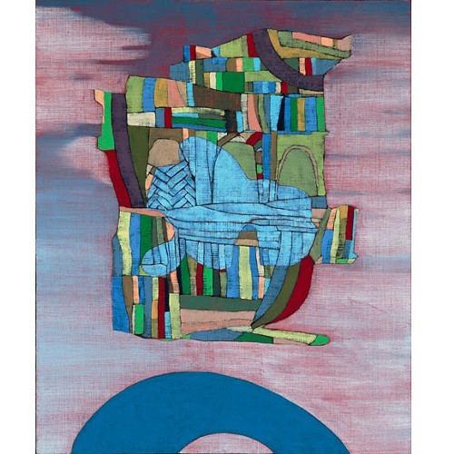
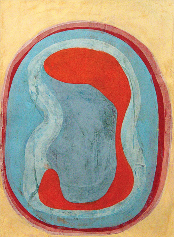 Hamlett Dobbins
 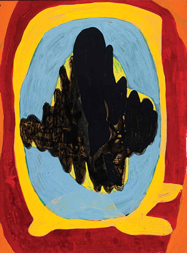 Hamlett Dobbins
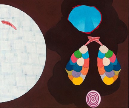
  Hamlett Dobbins
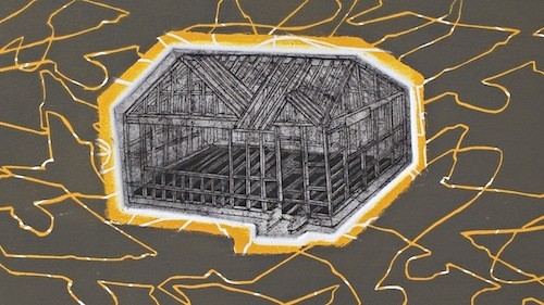
  Hamlett Dobbins
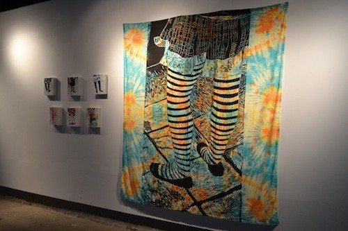