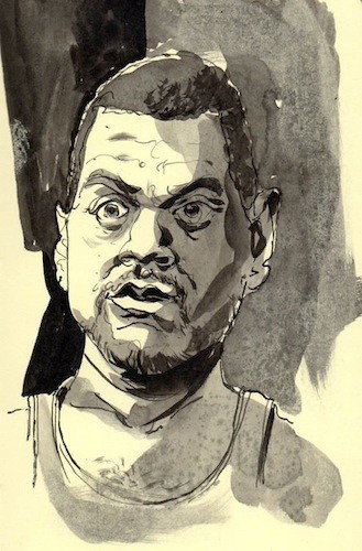
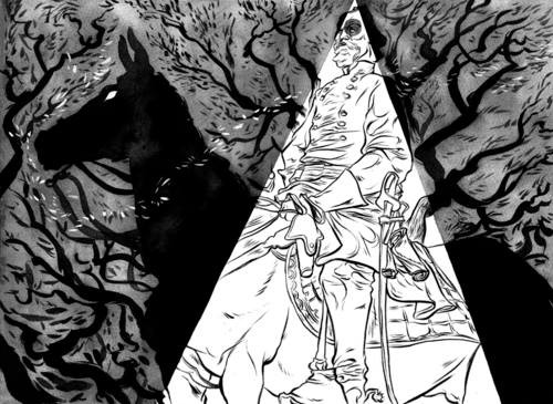
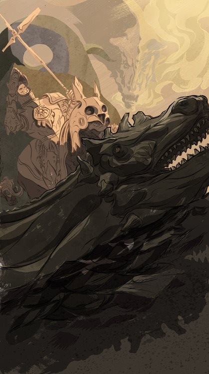
Memphis-based illustrator and comic artist Derrick Dent has drawn for Wired, The New York Times, and The Oxford American, among other publications. His brush and ink illustrations have the technical edge of a careful paintings and the caricatural verve of comics. His distinctive comics style takes its cues from the American graphic underground but deals with text and pacing in a way reminiscent of classic Japanese Manga. Dent’s most recent work, a graphic novella entitled MAJOR SLUG 2, follows the ups and downs of a “guy who compulsively punches people.”
I sat down with Dent recently over a cup of Otherlands’ coffee. We talked about dive bars, social media, MFAs, and brush quality. Dent, who is in his late 20s, likes “internet diets” (diets from the internet, not diets found on the internet), teaching, and character studies. He doesn’t like weird pick-up lines or artistic comfort zones.
On sketching:
Memphis Flyer: You brought your sketchbook. Can I take a look?
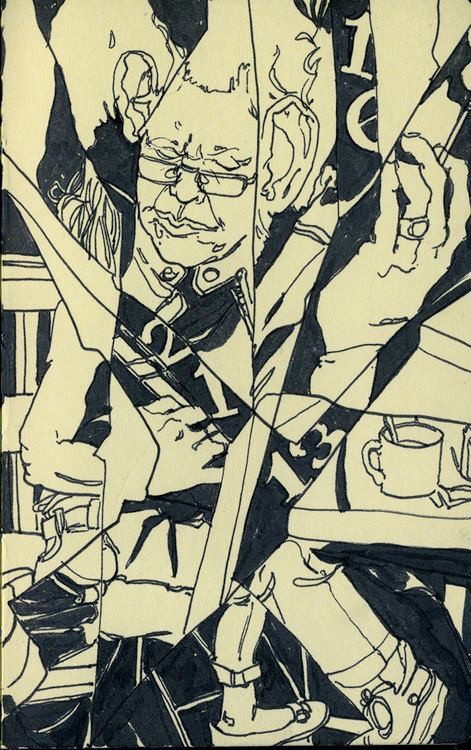
Derrick Dent: Sure, sure. At one point I fancied myself the kind of sketchbook artist and illustrator who would go to dive bars and draw people. The activities always ended up being mutually exclusive— I never ended up drawing and talking at the same time. Sometimes people would tell me weird stories. Sometimes [the stories] were complete non sequiturs.
… And you would end up illustrating those?
I would end up with the story in the back of my mind, but I always wished that I’d recorded it, if only for posterity, so that I could have held on to the narrative for some illustration project. It was a fun thing, for awhile. It was always a way for me to get out and talk to people.
Somebody is always going to talk to you if you are drawing in a bar.
Yeah, yeah. At the very least it is a “What are you doing?” or “I don’t see that happening very often.”
Anyway, this sketchbook is for this really informal community thing online called InkTober. This concept artist named Jake Parker started it and basically you’re making an ink drawing for every day of October, until the month is over. … That’s what this sketchbook mostly has been. There are times when a note or a small anecdotal detail slips in there.
[jump]
On school:
Did you train in Illustration?
Yeah, I studied drawing and illustration at MCA. When I was in school, the illustration students [at Memphis College of Art] really held together. There was a common personality type in the illustration department. Just a bunch of people who cared about drawing, and painting and their craft, obviously …
… But who weren’t totally into theory?
Definitely not. Which is not to say that we were the dumb jocks of the school; I guess we all had a certain attitude about image making, and why we should be doing it, and what it should be all about.
On social media:
Dent: I just had a conversation recently with my friend Jon Lee, who is an illustrator about social media stuff; about “personal branding” and putting yourself out there as a professional. I try not to build too much of a character. [laughs] I don’t post often enough; I don’t live on the internet. I give myself internet diets, sometimes, to avoid that cult of personality.
That seems important, especially if you’re trying to do something that takes a lot of concentration, like drawing. You really have to focus.
It’s about establishing a flow in the first place and not getting online and then waking up 2-3 hours later, staring at my browser saying, “What was I doing? How did I get here?”
On his new work:
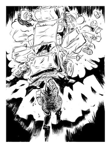
Dent: MAJOR SLUG 2 is probably the most earnest, and in-depth, and sustained effort that I’ve made to make something really silly. It’s essentially just a really long 30-page gag comic about a guy who compulsively punches people, and it is a sequel to a character comic I made last year, when I was teaching comics at MCA. [At MCA] I volunteered to do a “24-hour comics” day, and I made this 10-page comic. Ideally you can make a 24-page full-color comic, but few people have ever actually finished in the history of comics, ever. But I made this fun comic, and I went through a bunch of pretty much random character generation. I was like, “Okay, dude dressed like a dough boy…” [points to drawing]
That guy is awesome.
He is actually based on the sketch of a dude that I met at the Lamplighter. He comes in with his wife… or someone. This one [points to another drawing] is based on a guy who used to come into the art store I worked in and he would always try to hit on my roommate, and he would say the weirdest things to get her attention. We were at the Cooper-Young festival one year and he walks up to her and he looks at her and says, “Hey, how you doing? I just got stabbed six times.”
On his drawing process:
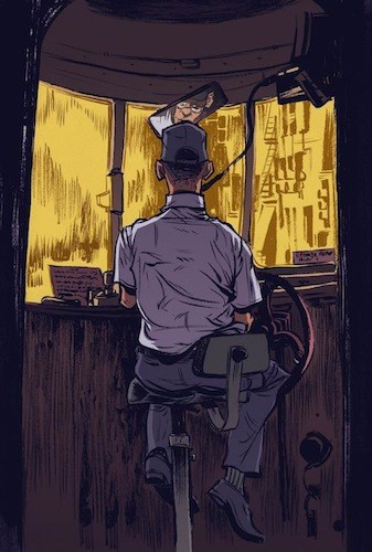
Dent: Usually it is a weird, Frankenstein’s monster of different processes. I use a really light lead pencil to do the sketches, and then I do the brushwork afterwards, and depending on how clean I want to final product to be, I’ll either leave it this way [with pencil marks] and clean it up in photoshop, or, sometimes, I’ll do the work with rough outlines, and then I will go back in and lay them in digitally. That gives me some flexibility.
I don’t have to worry about drawing outside the edges or being meticulous where I don’t want to be meticulous. It’s not so much “sloppy” as I want it to be fluid. I hate when my working surface gets in the way of marks I want to make.
I use a cheapy little flat brush with synthetic bristles, which have a little bit of spring, so I can quickly lay those marks down and the brush doesn’t give. For the line work, I use a series 7 Windsor Newton brush, and those are an industry standard. Comics people swear up and down by those.
With your comics, do you work more long-format, or do you do small panel comics?
I enjoy the long-form pacing with the stories that I like to tell. I’m still refining my storytelling skills. I still feel like my stuff is weird kind of character studies. I adopt Eastern storyteller sensibilities. There is an idea in Manga and Eastern films… a kind of emphasis on the moment or slow, mood-setting scenes. I feel like with longer-form comics it is easier for me to have those kind of contemplative pauses. Even when I am working with absurd comedy, it’s difficult for me to condense my work into a three-panel stip comic.
I just read a big graphic novel by Tatsumi, all about the history of Manga, about how it moved from slapstick stuff to taking after film more, post-WWII.
Oh, I’ve read that too— A Drifting Life. It’s incredible! I love [Yoshihiro Tatsumi] talking about how prolific he was, and the other guys he worked with. It’s hard for me, even now. If I crank out a couple pages in a day, after storyboarding, I’m like, “YEAH!” It’s amazing how fast some people’s hands move and how nimble some minds are.
On commercial illustration:
When you are doing basic illustration [not comics], how does that process differ from your comics process? Do you write to hash out your ideas?
I have to. Sometimes it’s really linear exposition, you know, in paragraph form, but sometimes I’ll just do word maps. If it’s for an article (like, if I am doing an editorial illustration), you always want to think about what the article is about. You don’t want to lose sight of what the crux of the information is. From there, it’s a matter of taking from your personal experience. I take what I know, and I think about what my immediate associations are with that. It is me plucking my memories, then making further associations. You’re kind of grasping for straws when you’re in ideation mode. But that’s where the meat of the work it. You know how to draw…it’s all about the content. You’re trying to make a concise visual decision. Sometimes the danger is that you have so many ideas.
I imagine that your illustration takes cues from your comics, and your comics take cues from your illustration.
Yeah! The thumbnailing and preliminary stuff I do for my illustration has made my comics much better because I consider the composition of each panel and each page, even. The page is a unit itself. The illustration benefits from a certain level of speed you pick up from working in comics.
Doing a comic, making all these little sketches, going in different directions…that’s kind of like jam band stuff. But you’re composing a song when you make an illustration.
You can download MAJOR SLUG 2 via derrickdent.com.
